
The way people access the internet has changed dramatically. More than 60% of global web traffic now comes from mobile devices. If your website is not optimized for mobile, you could be losing potential customers every single day.
What Does Mobile-Friendly Mean?
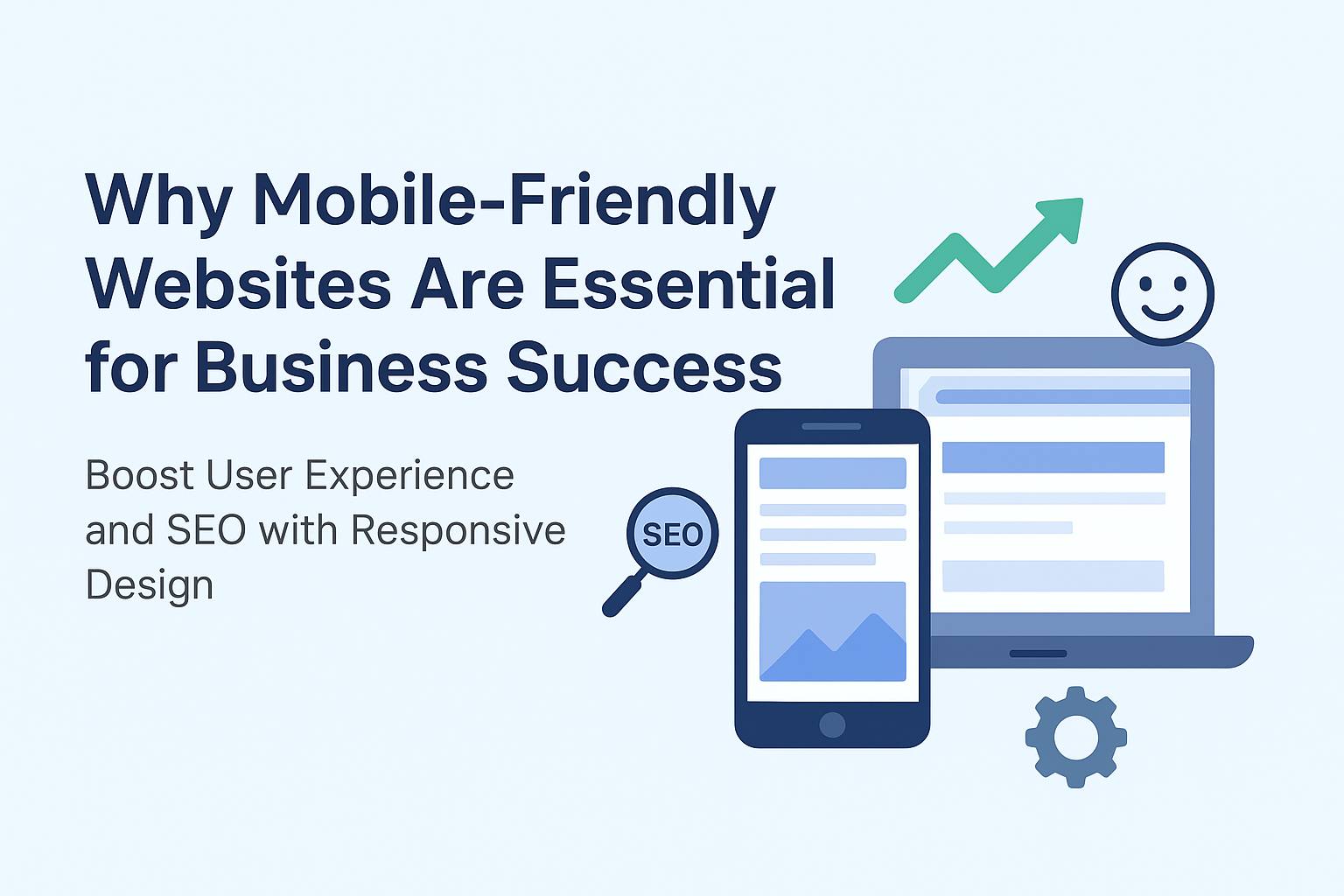
A mobile-friendly or responsive website automatically adjusts its layout, text, and images to fit any screen size—whether it’s a smartphone, tablet, or desktop.
Benefits of Having a Mobile-Friendly Website
- Improved User Experience – Visitors can easily navigate and engage with your site on any device.
- Higher Google Rankings – Google prioritizes mobile-friendly websites in its search results.
- Faster Load Times – Responsive designs are optimized to load quickly, reducing bounce rates.
- Better Conversion Rates – Customers are more likely to take action when the browsing experience is smooth.
- Future-Proofing Your Business – With mobile usage rising, responsive design ensures long-term success.
How to Make Your Website Mobile-Friendly
- Use responsive design frameworks like Elementor or WordPress themes
- Optimize images and media for fast loading
- Keep navigation menus simple and clear
- Ensure buttons and forms are touch-friendly
- Test across multiple devices regularly
Conclusion
In today’s digital landscape, a mobile-friendly website is not just an option—it’s a necessity. Businesses that prioritize responsive design will enjoy improved visibility, customer satisfaction, and revenue growth.